
The role of the logo in shaping the brand image is very difficult to overestimate. By one small emblem, a potential buyer can recognize the manufacturer and want to purchase a product, or vice versa – bypass it. The vast majority of marketers are actively promoting rebranding, so most logos change over the years, adjusting to the changing trends of culture and graphic fashion.
Twinings
From 1706 to the present, the doors of the brand store in London on Strand Street have been open to their customers. But the most amazing thing is that above the entrance to the store and on the packaging of the products manufactured by the brand, not their corporate emblem flaunts, but the coat of arms of Great Britain. This symbolizes the highest quality Twinings teas, which are served even at royal teas.
For more than two centuries, the coat of arms of the most famous English tea company has remained virtually unchanged and is the oldest logo in the world.
Guinness
In 1876, Briand Boru’s medieval harp was registered as the official trademark of an Irish beer manufacturer, and it appeared on the manufactured products back in 1862. Interestingly, the harp is the logo of Guinness and Ireland, so it is also present on the country’s official coat of arms, but its image is inverted in a mirror image.
Levi’s
Sturdy canvas pants for workers – these are the jeans known to everyone today. In the late 19th century, Levi Strauss worked with tailor Jacob Davis to develop one of the brand’s most recognizable marks, a leather rectangle depicting two horse riders trying to rip jeans. So illiterate American workers could clearly see how durable jeans produced by Levi Strauss are.
And now many fashionistas dream of jeans with two horses on their emblem.
Johnson & Johnson
Today we know this brand as a manufacturer primarily of baby skin care products. But since 1886, the Johnson brothers have been engaged in the production of sanitary and hygienic products – sterile dressings, plasters, cotton-gauze dressings. This company, through its products, contributed to the reduction of mortality after surgery.
The logo bears the name of the brand, written in a pen handwritten by one of its founders – James Wood Johnson. The logo has not changed for many decades, as well as the values of the company.
Shell
It all started with a small trading company in London that specialized in the sale of antiques and souvenirs, including rare seashells. In 1891, Shell took part in the transportation of kerosene to the Far East.
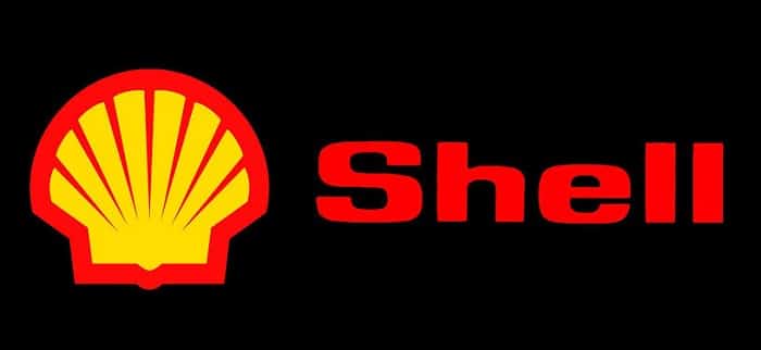
In 1900 the mussel shell became the logo of the company, in 1904 it was replaced by the more presentable scallop shell. It is she who is still the symbol of Shell, as a symbol of the fact that the company remembers and appreciates what its history began with.
Yamaha
In 1927, the logo of the Japanese motorcycle manufacturer Yamaha was updated. Previously, the moto logo of this company was decorated with a phoenix with a tuning fork in its beak, which was replaced by a star of three crossed tuning forks. The three crossed musical instruments symbolize the strong bond between Yamaha’s three pillars – technology, production and sales.
There is a long history behind each described logo. If the company does a rebranding, then the main symbol remains unchanged. This is how the brand demonstrates its respect for history and tradition.