Facebook’s compact, single column look has been making the headlines for quite some time. The pages were automatically updated to the newer look which besides being streamlined makes the pages easy to be managed efficiently.

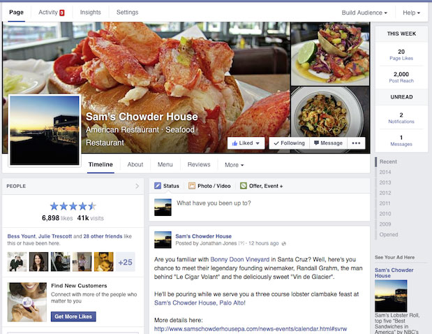
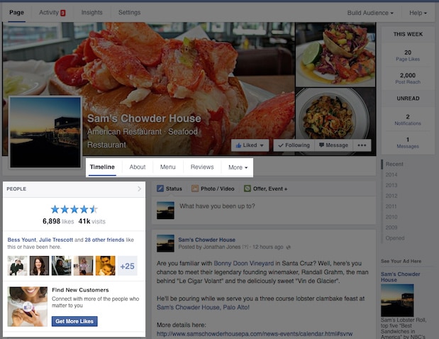
The newer version of the timeline, as launched by Facebook, makes the posts on the pages appear stacked on top of each other, just like they appear in the news feed. This allows scrolling through the posts easier. The latest layout has been designed in a way so as to display the important and significant information related to your business, company, product (or whatever your page is promoting) on the left hand side column. Important info first, seems to be the rule that has been followed as the “about” of your company/product comes first. It displays your company details as well as site URL, important addresses and phone numbers.

The photos and videos on your page are neatly piled below the information column on the left. The right side of the page is dedicated to the listing of your “likes” immediately followed by all the posts that other people make on your page, which is succeeded by your page’s own posts. This newer system has effectively compartmentalized the whole look of the Facebook pages making instant access to the relevant section of the page easier than ever.

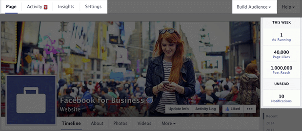
These changes have also allowed the page admins to have better control of the page’s performance. However, the new design has given way to concerns as the advertisers find the new arrangement somewhat disconcerting. The new design, as voiced by them, places the ads right at the bottom of the pages where they are less likely to be seen. However, these issues were tended to by Facebook shortly afterwards.
Another of the changes that have been recently introduced is complete control over the placing of various sections as per need and preference. This allows the admins to make first and the foremost things go first.
The new design has been a gust of fresh wind from the confusing, multi column look that Facebook had employed before. The unnecessary scrolling back and forth between two columns is no longer an issue for the Facebook users, especially when it comes to pages’ feed. This has also eliminated the need for the pages’ admins to open multiple tabs or to scroll all the way back for viewing messages, notifications, new likes etc. Facebook is likely to introduce further changes to the single column look in order to make the usage of Facebook all the more efficient.


Leave a Reply