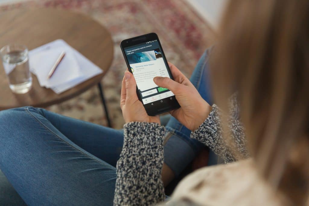
Like all other platforms, email marketing is turning mobile-first with more than half of the email opens (53%) coming from mobile devices. With 73% of millennials expecting businesses to communicate over emails, missing on mobile-friendly emails is no longer an option. Mailchimp templates and Pardot templates are some of the mobile-responsive templates that can help you get started.
In this article, I am going to share five essential tips for building custom email templates with a mobile-first approach. I will cover both technical and non-technical aspects for your ready perusal. Read the article ahead to get actionable insights on the topic.
Keep The Subject Lines Short And Use Preheader Text
Gone are the days when 60 character subject lines did the job. Some email clients display only upto 25-30 characters, and thus, you need to keep your subject lines crisp at around 40 characters. Even if your subject line can’t be cut down, ensure that you put up the most important words in the first 40 characters.
You need to put a lot of emphasis on the copywriting aspect of your email. I also advise you to also use an appropriate preheader text. You don’t necessarily need to include the preheader text in your email body, but it should support your subject line to improve your open rates. Remember, even if you use the best looking professional email templates without a good subject line, you won’t be getting many click-throughs.

Stick With Single Column Email Templates
The mobile screens resemble vertical bars, and hence you should avoid using landscape orientation when it comes to choosing your email layout. Using single column responsive HTML templates is a must if you want to ensure your good visibility for your recipients. Single column templates can be read effortlessly across all mailbox providers and device types. They are easy to navigate and make it simple for email developers to put the content blocks in the right place for higher engagement. Your readers won’t need to zoom in or horizontally scroll for reading your message and emails that fit into the screen size automatically look better in terms of aesthetics.
Limit The Width Of Your Email To 600 Pixels
Now, this is an unwritten rule of the email marketing industry: keep your email templates within the 600-pixel mark. The bigger computer or tablet screens have no problem in displaying the 600 pixels wide messages, but mobile screens work the best with this width.
It is done either by setting up the width attribute in the table tag of the email template or using the CSS styling. This helps in keeping the content blocks aligned with the visual appeal of mobile-friendly emails, and you can cater a consistent user experience across the operating systems and device types including desktops. This is especially important for businesses willing to lead customers to their websites or make a purchase from the links given inside the message.
Use Only One Call To Action Button And Position It For Accessibility
Using only one call to action (CTA) button is a great way of making things easy for your subscribers. Generally, people use more than one CTA button inside their messages, but for mobile-optimized emails, it is essential to keep at most one 44×44 pixel CTA button and use a visible hyperlink for the secondary one. It helps your reader easily follow the message and take action without scrolling up and down.
Also, ensure that a button is large enough since people don’t technically click on them, we tap with our fingers. You should keep them at the center of the email body, and they should be clearly distinguishable from the background. Email developers also advise using persuasive text inside the buttons for better CTR results. Don’t forget to isolate them properly from other CTAs used for unsubscribing and links to social media handles.
Use Fewer And Lighter Images

Using images in your emails is extremely attractive since we are all accustomed to seeing a lot of visuals in our day to day life. However, you should be cautious while doing so. It is wise to use fewer images and keep their size low. This helps ensure seamless deliverability for low bandwidth-latency regions.
Another thing I would like to highlight is that you should not include text inside the images. Many email clients turn off images by default, and thus you need to ensure that your email copy is self-sufficient. One common mistake I see across many messages is embedding the CTA button in an image which is also malpractice.
Wrap Up
I have included the top five essential tips for mobile optimization, but you shouldn’t miss out on creating concise email copies. Try to keep your copy short and break it down into small, readable chunks. Following the tips mentioned above, along with this approach, will help you to make the most out of responsive HTML templates. I hope you find these five tips useful for creating mobile-friendly messages for your next email marketing campaign.
Author Bio
Kevin George is the head of marketing at Email Uplers, which specializes in crafting Professional Email Templates, PSD to Email Conversion, and Mailchimp Templates. Kevin loves gadgets, bikes & jazz, and he breathes email marketing. He enjoys sharing his insights and thoughts on email marketing best practices on an email marketing blog.


Leave a Reply